Kitchen Renovation - Big Reveal is Finally Here!
So this post has been a loooooonnnng time coming, but I am thrilled to share the before and after images of my kitchen! It has been such a transformation to this house - it is incredible -and feel so lucky to have this kitchen as the kitchen I get to cook in everyday.
So backstory - in June of last year we purchased a house in Nashville. The house is a 1920s four square that has had some updates but the kitchen needed a lot of work. When looking at houses I gravitate to houses where the kitchen needs work. We did this with our house in Oakland. The reasoning that since I work from our kitchen, I have specific needs of things that I want and also I don’t want to pay a premium on a kitchen that I may not like.
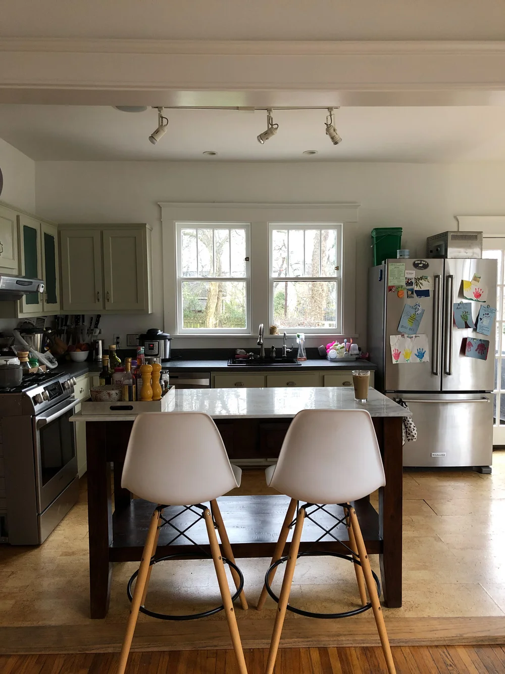
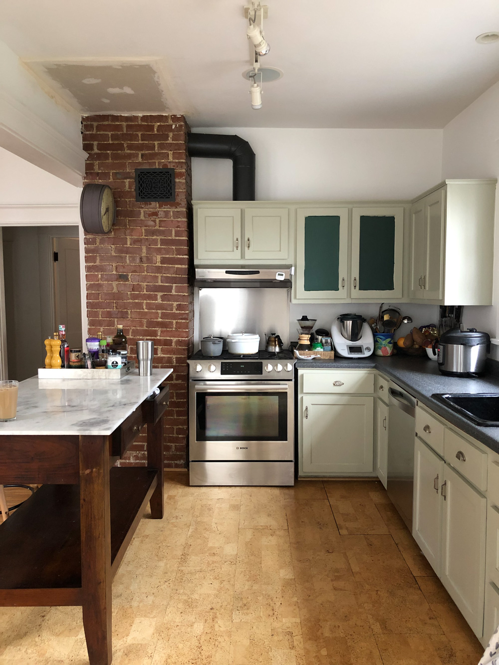
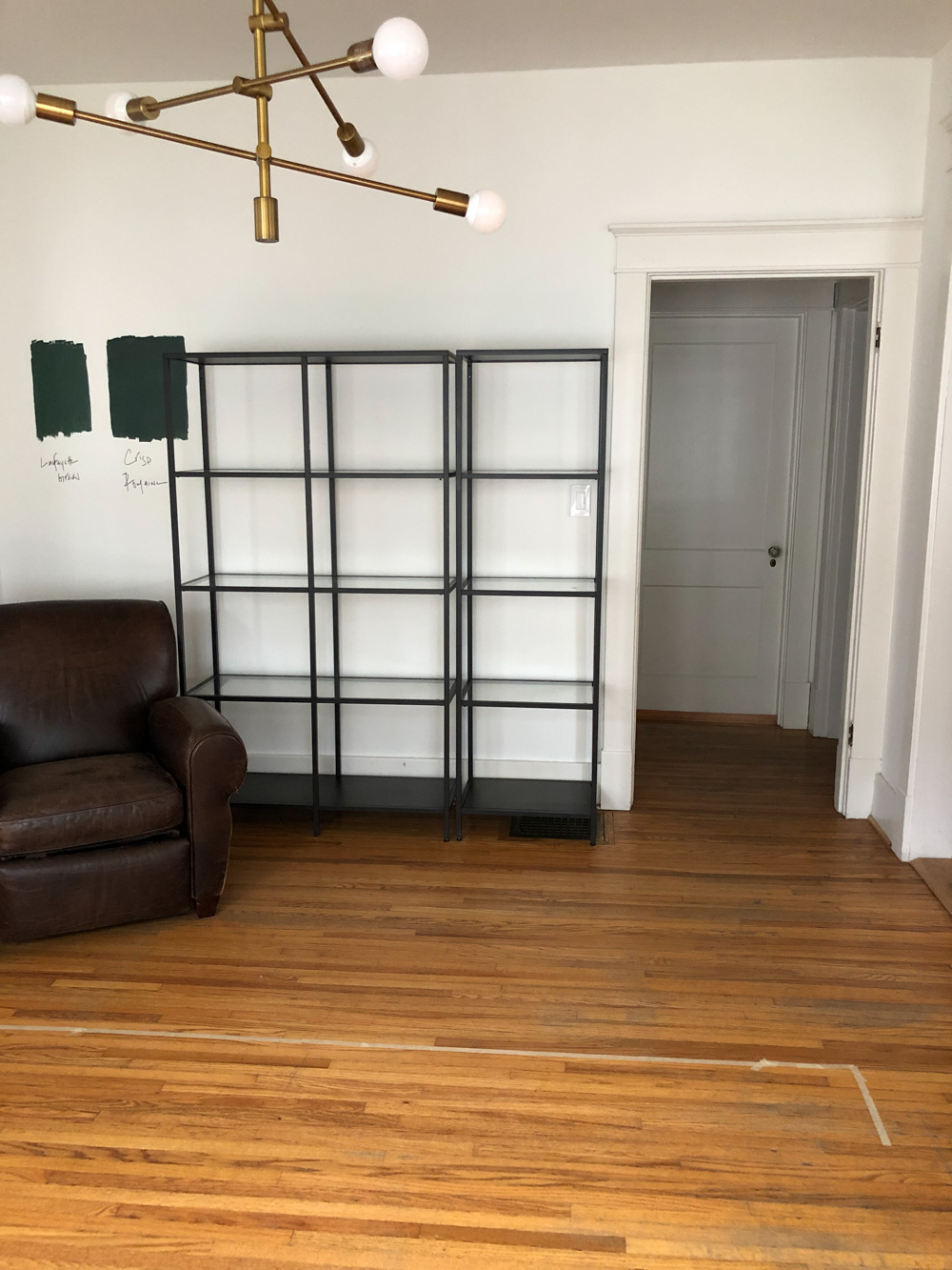
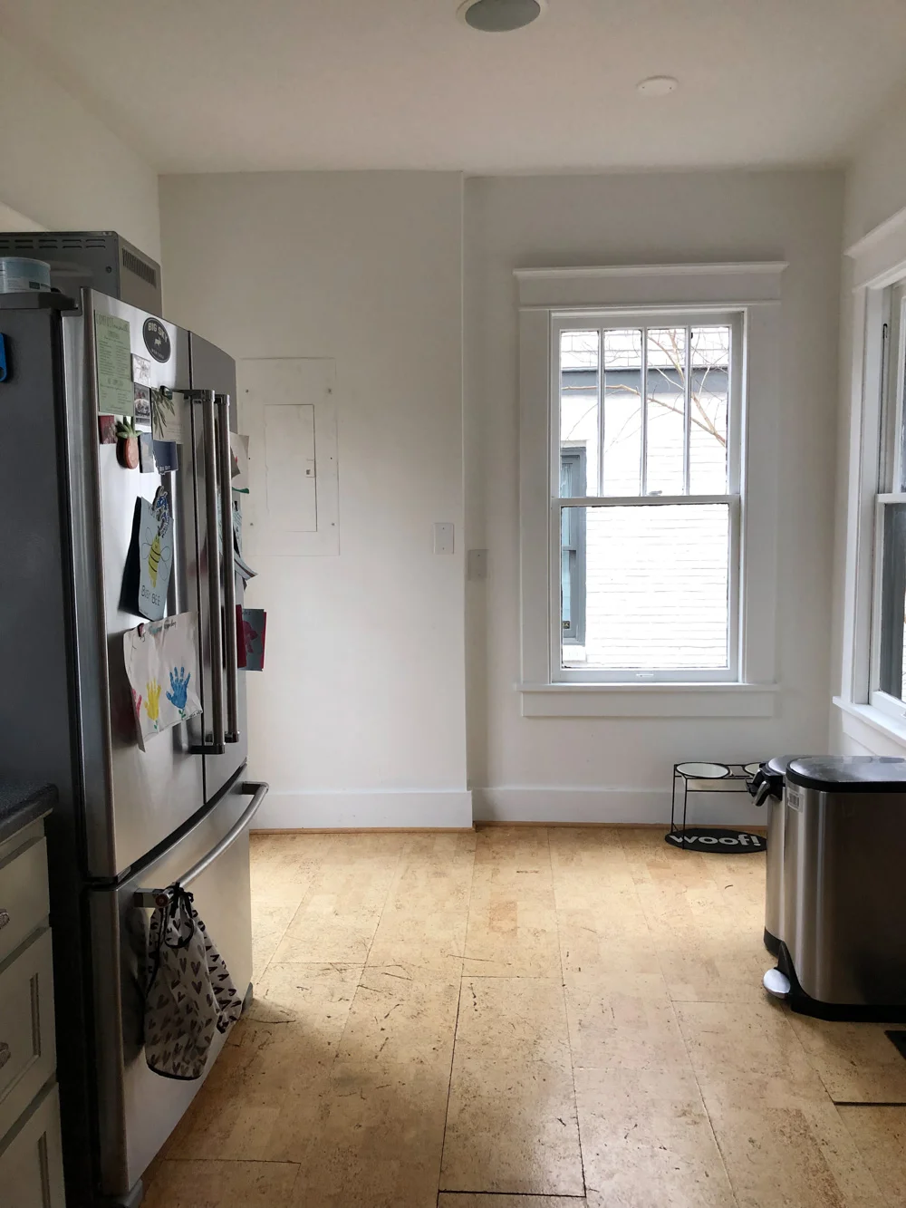
Swipe through for some of the before images of the kitchen.
The kitchen needed a lot of work. Some highlights…the warped cork flooring, the black formica countertops, and black ceramic sink. The biggest issue with the space was the poor space planning (or lack there of) of the kitchen. The kitchen was a small rectangle at the back of the house but right next to it was this wasted room that had been used as a dinning room but there was also another dinning room right next to it. We lived with the space for about 9 months, which I fully recommend doing so you get to know the space and how it works and how you work in it. It wasn’t the most enjoyable place to cook, especially when a huge leak from an upstairs toilet starting dripping through, but I am so glad we did, it gave us a better perspective on what we wanted.
Enter my friend and designer Lauren Bradshaw. I met Lauren in Nashville when I first moved here. We have mutual friends and actually lived within a couple blocks of each other in LA before finally meeting in Nashville. Lauren came into the kitchen and totally saw the potential. I love her design vibe of mixing a modern aesthetic but with an appreciation for the historic and handmade. I wanted to be true to the 1920s bones of the house but also wanted it to be fresh and modern. Lauren suggested we combine the current footprint of the kitchen with the unused extra dinning room space and by doing that flip the orientation and create a huge working kitchen. We would have to close up a door to the guest room but could create access to that room by removing a closet and pantry. So that is what we did and it is just amazing! And huge and I love it.
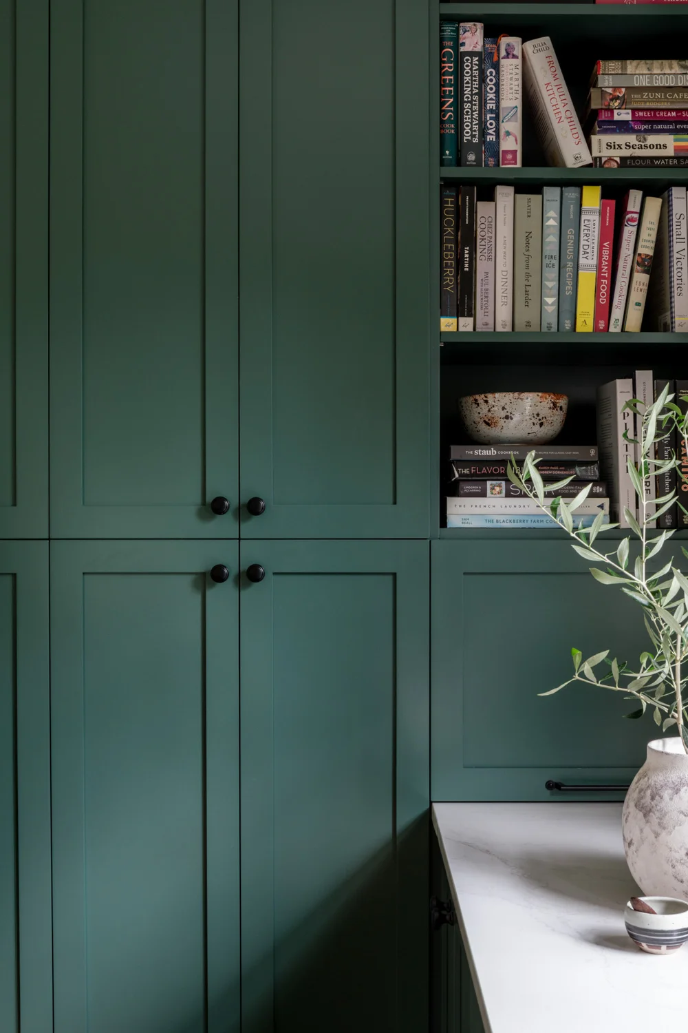
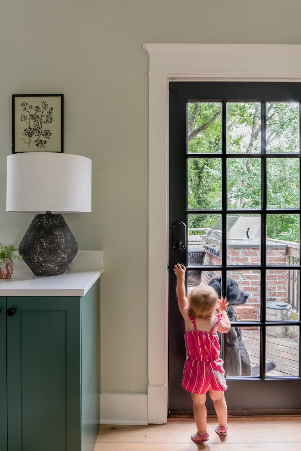
We had an amazing contractor, who also runs a cabinet company with his wife Donna, Noble Cabinet Company. They created semi-custom cabinets for the space, meaning I could pick a custom color for the door fronts. We went with a dark green by Benjamin Moore called Crisp Romaine. When I first visited Nashville before moving here I was struck with how green everything was and that color has just stayed with me when I think about Nashville. We are fortunate enough to have a backyard that is filled with greenery and trees and since the kitchen overlooks the backyard I wanted to pull in that green color into kitchen as well.
Next up were the floors. The cork floors had to go and we debated putting in tile but in the end decided to redo all of the floors on the first floor of the house. The floors on the second floor had already been redone and the existing floors we warped, yellowed, and not taken care of. This was a hard decision to make since I love old wood floors but they beyond repair. To make the home feel a bit more modern and light we went with a wide white oak plank from a local flooring company called Textures here in Nashville.
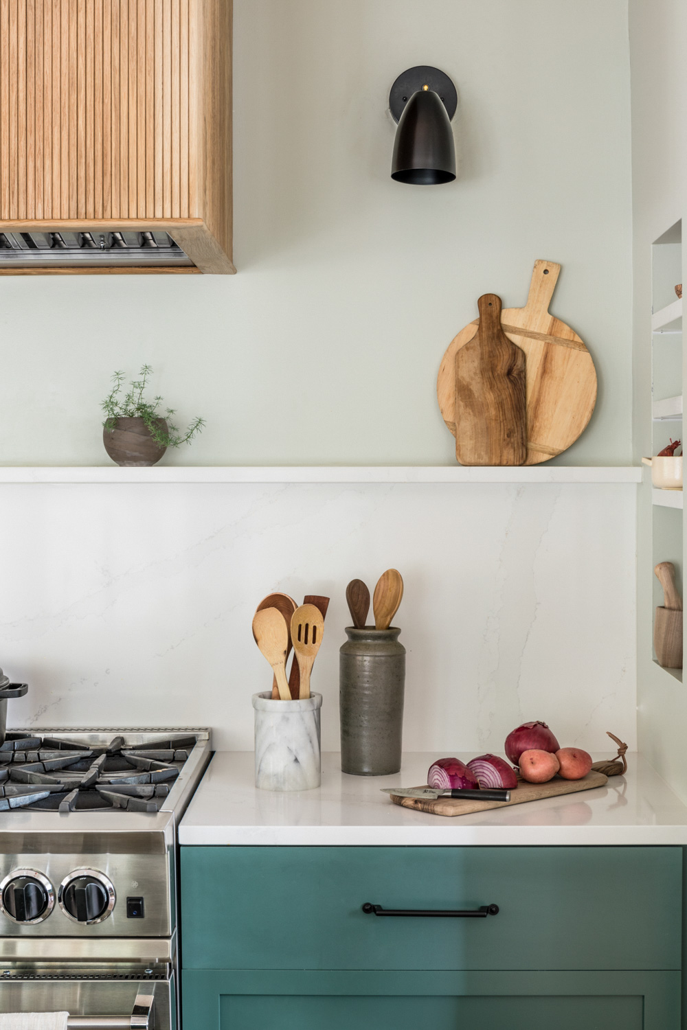
Onto the countertops! I have a full post just on countertops here but we decided to go with Silestone’s Eternal Calcutta which looks just like marble but is way more functional, durable, and stain resistant than regular marble. Knowing how much use this kitchen was going to get from my work and having a toddler running around, I didn’t want to have to worry about the countertops getting stained. Check out more on the countertops here.
Next let’s talk appliances. We decided to go with BlueStar - also have a full post that goes into more detail about the appliances here - and absolutely love them. They are highly functional and sleek and are made like an appliance for a commercial kitchen. We got a built-in fridge and it is huge and glorious. Everytime Luke opened it when we first installed it he just kept on commenting on how beautiful it was. And it is!
The kitchen fixtures are from Franke and they are just gorgeous and streamlined. We went with a stainless steel under-mount sink that came with a built in compost bin and place to soak dirty utensils. It is funny, I have a huge appreciation for my sink especially after the one that was in the house but the sink and faucets are one of the first things people comment on when in the space - I think because they are so sleek and clean.
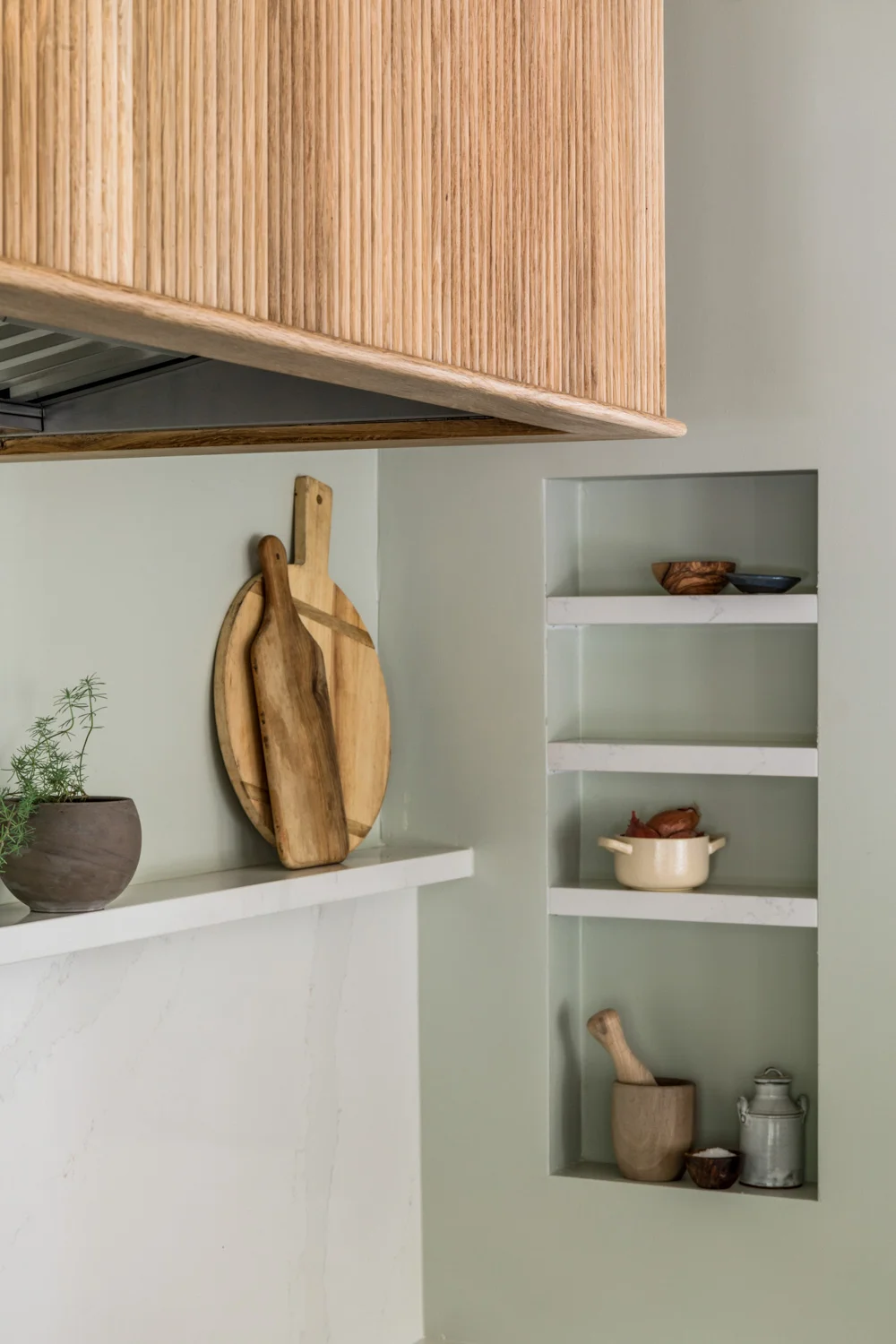
Next, lets talk about the custom hood. Lauren had this genius idea to create a custom hood overlay that would anchor the space and also since I show my kitchen on social media so much, allow people to immediately recognize the space. I went back and forth on whether we should do it mostly to try and save a little money but I am so incredibly glad we did. Lauren worked with a local Nashville mill called Vintage Millworks to create reeded wood that matched the color of the floors. Our contractor then created the hood overlay around the Zephyr Hood. It is stunning. Plus we had extra wood that we then used on the banquet. I love the subtle texture and drama that wood creates and it is also completely custom to the kitchen which is extra special.
The light fixture above the island and the sconces are from this amazing local company called Southern Lights Electric. They custom made the light fixture above the island because we were looking for something that was long, sleek, and simple. The light fixture above the banquet is from Target (!!). Sadly it is sold out but if it ever comes back make sure to grab one - for about $60 it packs a lot of bang for its buck!
I have listed all the resources below in a quick recap. We couldn’t be more thrilled with house the kitchen turned out. It is fresh, clean, bright, and welcoming. Lauren did an incredible job and her vision was impeccable. Check out the more in depth posts about the appliances and countertops .
Resources
Designer : Lauren Bradshaw
Contractor : Noble Cabinet Company
Range and Refrigerator : BlueStar
Countertops : Silestone in Eternal Calcutta
Faucets and Sinks :Franke
Paint colors : Cabinets - Benjamin Moore Crisp Romaine, Walls Farrow & Ball Mizzle
Hood : Zephyr
Flooring : Textures
Banquet table : Modholic
Light fixtures : Southern Lights Electric
Custom Hood: Wood by Vintage Millworks, carpentry by Noble Cabinet Company
Photographs of the Kitchen: Joseph Bradshaw
**Kitchen styled by Lauren Bradshaw and Redo Home & Design for photoshoot


